")
")
Customizing your widgets with your own color patterns and adding custom behaviour to widgets helps you make great apps. Even better if you can re-use once written widgets everywhere in your app.
Introduction
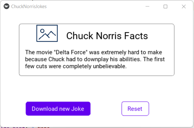
Kivys design is based on the mobile for linux framework. It has a very simplistic design and can be considered elegant but there are more modern frameworks like the Material Design available which is used on Android systems. In this article are we going to make our Chuck Norris Jokes App look more Material Design like. You will also learn how you can define a widget once and re-use it everywhere in your app.
We will create outlined and contained buttons with the ripple behaviour to indicate a touch as well as a simple card design to present our jokes.
The Code
Let's start by working on our kv file. First the background of our root widget shall be a flat white surface which is achieved by drawing a white rectangle on the canvas which is just the size of the widget. It will automatically be resized when you maximize the window of your app.
In addition you have to create a card and a ContainedFlatButton and a OutlinedFlatButton. Don't worry about the exact definition for now, here we just use it.
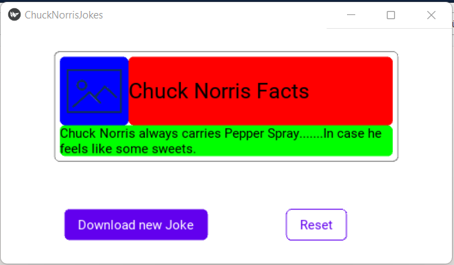
ChuckNorrisJokes:

    canvas.before:
        Color:
            rgba: self.color
        Rectangle:
            pos: self.pos
            size: self.size
    Card:
        id: card
        title: 'Chuck Norris Facts'
        text: root.joke
        icon_url: root.icon_url
        pos_hint: {'center_x': .5, 'top': .9}

    ContainedFlatButton:
        id: btn1
        text: 'Download new Joke'
        pos_hint: {'center_x': .3, 'y': .1}
        on_press:
            root.get_new_joke()

    OutlinedFlatButton:
        id: btn2
        text: 'Reset'
        pos_hint: {'center_x': .7, 'y': .1}
        on_press:
            root.reset_joke()
Below the definition of our layout are we going to create so called rules. One for each widget we have used in the code above. A rule is enclosed by <RuleName>: and finished with a :.
We start with the contained flat button. Accoring to the Material Design guides should it look somewhat like this here:
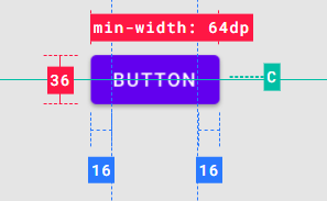
We need a rounded and filled rectangle as backround with a label on top of it. The important thing is that we bind the labels text to the text variable of the root widget which is ContainedFlatButton. By this we can simply modify the text variable once we implement the rule in our app and the text will be changed. If we don't do that the place holder "I am a button" will be shown.
<ContainedFlatButton>:
    text: 'I am a button'

    size_hint: None, None
    minimum_height: dp(36)
    minimum_width: dp(64)
    padding_horizontal: dp(16)
    padding_vertical: dp(8)

    width: max(root.minimum_width, lbl.texture_size[0] + 2 * root.padding_horizontal)
    height: max(root.minimum_height, lbl.texture_size[1] + 2 * root.padding_vertical)

    canvas.before:
        Color:
            rgba: self.color
        RoundedRectangle:
            pos: self.pos
            size: self.size
            radius: 6,6,6,6
    Label:
        id: lbl
        text: root.text
        pos: root.pos
The next rule is the OutlinedFlatButton. The main difference is that we do not draw a rounded rectangle but we draw a line around the outline of the widget.
<OutlinedFlatButton>:
    text: 'I am a button'

    size_hint: None, None
    minimum_height: dp(36)
    minimum_width: dp(64)
    padding_horizontal: dp(16)
    padding_vertical: dp(8)

    width: max(root.minimum_width, lbl.texture_size[0] + 2 * root.padding_horizontal)
    height: max(root.minimum_height, lbl.texture_size[1] + 2 * root.padding_vertical)

    canvas.before:
        Color:
            rgba: self.color
        Line:
            width: dp(1)
            rounded_rectangle: (self.pos[0], self.pos[1], self.size[0], self.size[1], 6)
    Label:
        id: lbl
        text: root.text
        color: root.color
        pos: root.pos
Finally the card has to be created. There are no strict definition for a card by the Material Design guides but this here is kind of the template we are trying to follow.
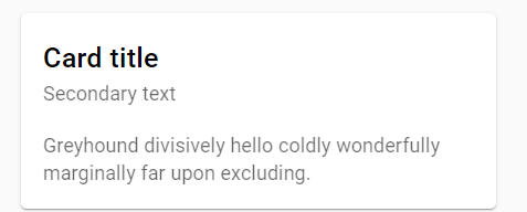
That requires some more lines of code but it is straight forward. Again we start with drawing an outline around the whole widget. Since the Card has inherited from the BoxLayout we add another BoxLayout in the first row of the card which is supposed to show an image and a title for the card. In the next row there will be only a label showing our downloaded joke.
<Card>:
    title: 'I am a title'
    text: 'I am a text'
    icon_url: ''

    padding: dp(6)

    size_hint: None, None
    width: dp(400)
    height: box.height + lbl.height + root.padding[0] * 2

    orientation: 'vertical'

    canvas.before:
        Color:
            rgba: self.outline_color
        Line:
            width: dp(1)
            rounded_rectangle: (self.pos[0], self.pos[1], self.size[0], self.size[1], 6)

    BoxLayout:
        id: box
        orientation: 'horizontal'
        size_hint: 1,None
        height: dp(80)

        AsyncImage:
            size_hint: None, 1
            source: root.icon_url
        Label:
            text: root.title
            color: root.color
            halign: 'left'
            valign: 'top'
            font_size: 25
            size_hint: 1, .8
            size: self.texture_size
            text_size: self.width, None
    Label:
        id: lbl
        text:root.text
        color: root.color
        halign: 'left'
        valign: 'top'
        size_hint: 1, None
        size: self.texture_size
        text_size: self.width, None
The image here wher I highlighted the canvas of each widget give you a better view of how everything is aligned. And you can pretty clearly see the padding of 6dp.
Taking care of the Python file now starts with defining the color scheme. The basis is this pattern here from which we only use the primary and on_primary colors. To make them available for every widget are they added to the class which inherits from App. The only thing we have to do is to convert the hex values in the material design color scheme to the rgba values Kivy requires. Lucky us that this is taken care of by a Kivy provided funtion.
class ChuckNorrisJokesApp(App):
    colors = {'primary':'#6200EE',
              'background': '#FFFFFF',
              'on_primary':'#FFFFFF',
              'on_background':'#000000'}

    def __init__(self, **kwargs):
        super(ChuckNorrisJokesApp, self).__init__(**kwargs)
        self._colors = {}
        for key, value in self.colors.items():
            self._colors[key] = get_color_from_hex(value)
Our buttons are a bit mor complex now. We cannot simply use the button class anymore to inherit from. First our button is a layout. A floatlayout to be specific. But we also want it to behave like a button and to deal with the on_press event and others. Thats why it also needs to inherit the ButtonBehavior. Last we want the so called ripple behaviour which is specified in the material design which is a simple overlayed animation over the button to indicate that it is being pressed. Therefore we lastly inherit from TourchRippleBehavior.
class ContainedFlatButton(TouchRippleBehavior, ButtonBehavior, FloatLayout):

    def __init__(self, **kwargs):
        super(ContainedFlatButton, self).__init__(**kwargs)
        self.color = App.get_running_app()._colors['primary']

    def on_touch_down(self, touch):
        if self.collide_point(touch.x, touch.y):
            touch.grab(self)
            self.ripple_show(touch)
            return super(ContainedFlatButton, self).on_touch_down(touch)


    def on_touch_up(self, touch):
        touch.ungrab(self)
        self.ripple_fade()
        return super(ContainedFlatButton, self).on_touch_up(touch)
The outlined button is created in a similar way. The only change is that we need to set the color of the ripple to match our primary color. The standard color is white which is fine for the contained button but would have no effect on the white backround of our outlined button.
class OutlinedFlatButton(TouchRippleBehavior, ButtonBehavior, FloatLayout):

    def __init__(self, **kwargs):
        super(OutlinedFlatButton, self).__init__(**kwargs)
        self.color = App.get_running_app()._colors['primary']

    def on_touch_down(self, touch):
        if self.collide_point(touch.x, touch.y):
            touch.grab(self)
            self.ripple_color = App.get_running_app()._colors['primary']
            self.ripple_fade_to_alpha = 0,6
            self.ripple_show(touch)
            return super(OutlinedFlatButton, self).on_touch_down(touch)

    def on_touch_up(self, touch):
        touch.ungrab(self)
        self.ripple_fade()
        return super(OutlinedFlatButton, self).on_touch_up(touch)
The simplest class is the Card. Since we don't have to take care of specific events it boils down to defining the colors for the outline. We take the on_primary color (black) and set the transparent value to 50%.
class Card(BoxLayout):

    def __init__(self, **kwargs):
        super(Card, self).__init__(**kwargs)
        color = App.get_running_app()._colors['on_background']
        self.color =  color.copy()
        color[3] = 0.5
        self.outline_color = color
Source Code on GitHub
The latest version of the code is always available for you on GitHub
https://github.com/HaikoKrais/ChuckNorrisJokesApp
What's Next
After learning about the basics, from creating an app using the basic widgets proviede by Kivy, modifying them to suit your design ideas and working a bit with the kv language is it now time to learn about animating widgets and learning how to built a classic game. Sneak.